


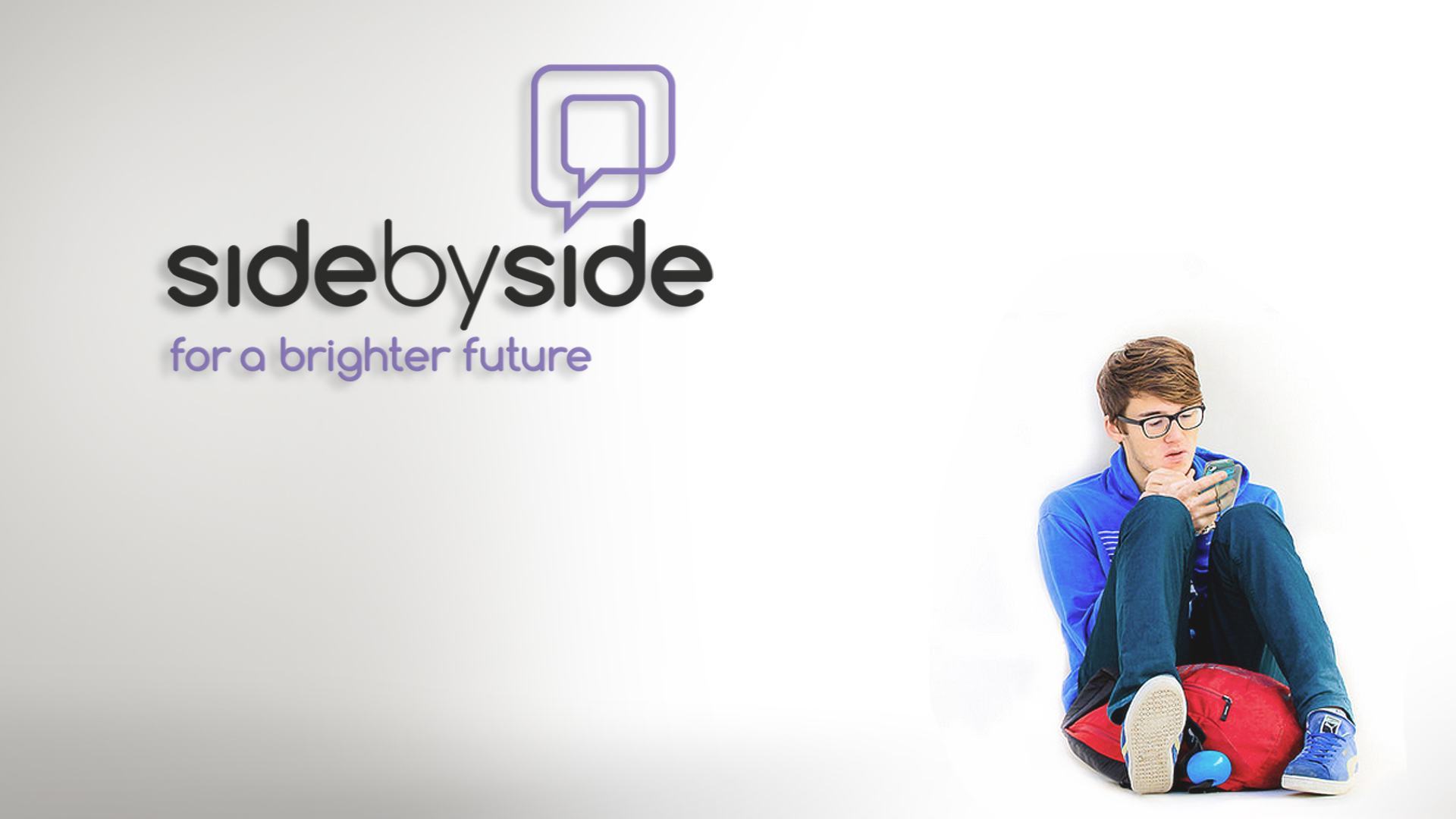
Side by Side
Towards a brighter future
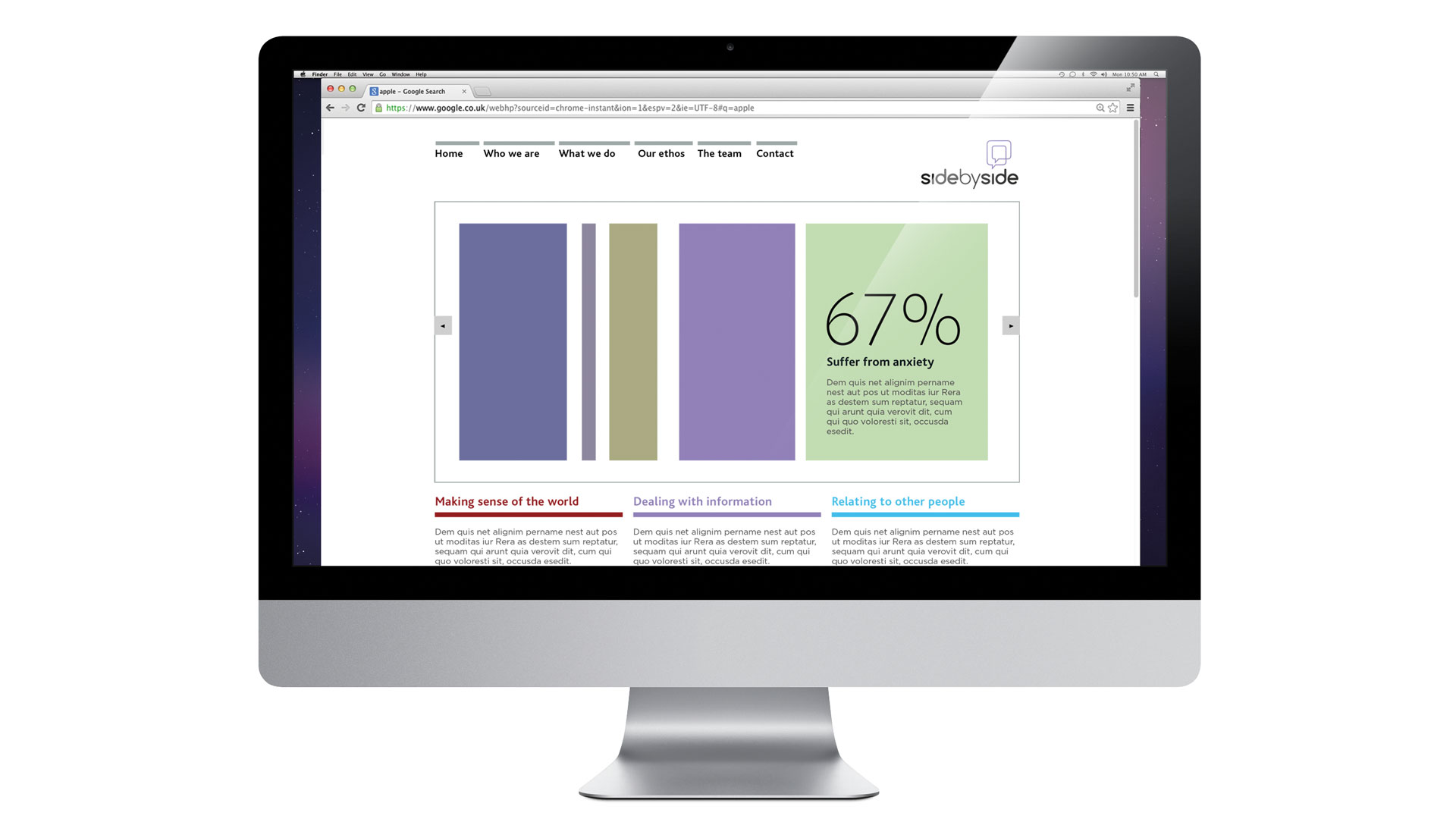
Side by Side are a team of coaches, who predominantly work online, providing one-to-one sessions for people living with Autism, ADHD or Aspergers.
Their clients want the confusion taking out of their life. They often have difficulty:
• making sense of the world
• dealing with information
• relating to other people
The aim is to teach them coping strategies to help deal with the complications of modern life and in doing so make their lives better.
Keeping things clear and simple is at the centre of what Side by Side do, it provides them with the focus to concentrate on the solution. The ethos of clarity and simplicity has been carried through to the brand expression.
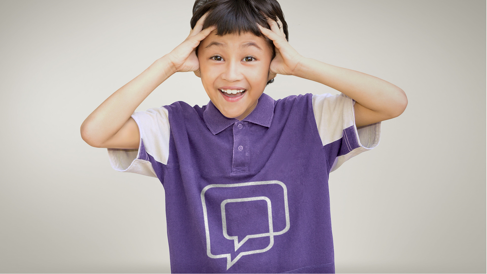
The idea behind the brand identity is the theme of coaching as a conversation.
Saint John developed the brandmark based on inter-locking speech bubbles and devised the strapline – ‘Towards a brighter future’, to encapsulate the benefits of Side by Side’s coaching.
What you see in the brandmark is what people get through the coaching:
• clients are put at the centre
• always honest and straight talking
• respect for clients and in return they expect them to respect the coaches
• friendly, warm and professional
The brand identity system is bold and simple as are the key statements that appear throughout all the print and digital channels.